San Francisco Real Estate: Looking Back, Looking Ahead
January 2014 Market Report
The real estate market recovery started in earnest in 2012 and then went white hot in spring 2013, which resulted in a huge jump in home prices. In the last six months of the year, the market calmed somewhat and prices generally stabilized, but buyer demand remained very strong by historical standards. Economic conditions have continued to improve, household net worth has increased dramatically with rising stock and housing markets, rents remain very high, new construction is soaring and interest rates, after jumping in 2013, are still relatively low. Though it is impossible to predict the future, these factors typically form the foundation of a healthy, active housing market.
In the next few weeks, new listings will start coming on market, buyers will get back in home-search mode and the market will begin to wake up after the holiday hibernation. Then we’ll start to get an inkling of what the new year has in store.
If you missed our survey of what San Francisco homebuyers bought in 2013, you can find it here: 2013 Market Survey. It was reported on by SFGate, KGO Radio and other major media.
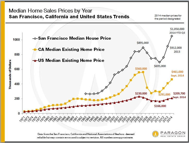
This first chart above gives a longer-term overview of city, state and national real estate price trends. Though varying by neighborhood, San Francisco has generally made a complete recovery from the market decline suffered in 2007-2011. Some city neighborhoods surged to new peak values in 2013.
————————————————–
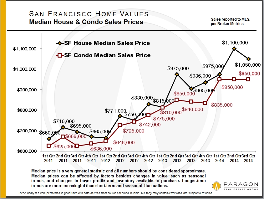
This chart below tracks San Francisco median prices by quarter, illustrating how the rebound in values progressed in steps since the recovery began.
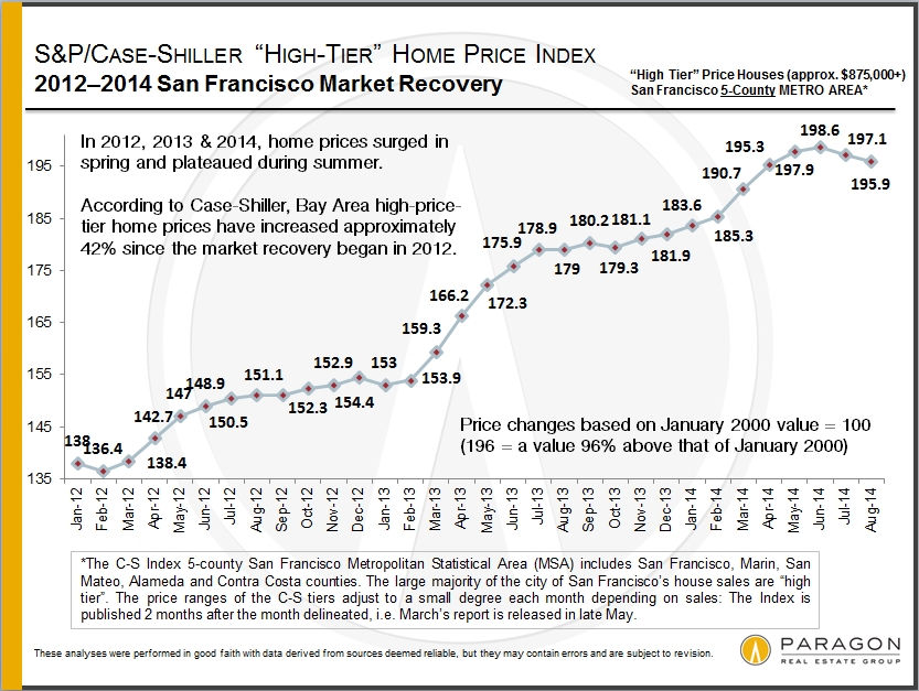
And below home value changes for Bay Area higher priced homes are charted over the past 2 years according to the S&P Case-Shiller Home Price Index.
————————————————–
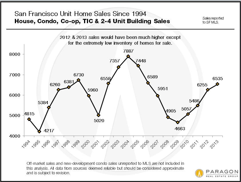
Total Home Sales by Year (below). The quantity of sales in the past two years has been severely constrained by an inadequacy of inventory to meet demand. This, of course, is also a major factor behind price increases.
————————————————–
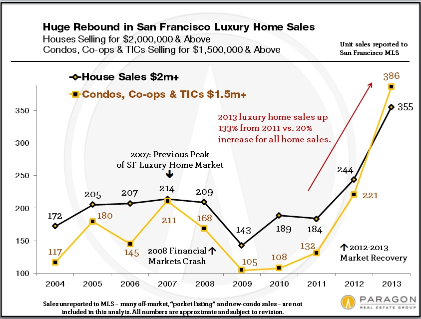
San Francisco Luxury Home Market
A major component of the recent recovery has been the terrific resurgence in luxury home sales. There are 3 main factors involved: firstly, the affluent have benefited most from the big surge in financial markets, which makes them feel even more affluent; secondly, our local high-tech boom has minted a large number of newly wealthy homebuyers; and finally, the simple increase in prices moves a certain number of home sales into the price categories we typically define as luxury.
————————————————–
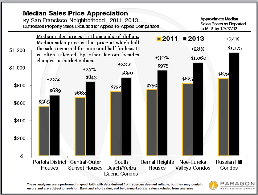
Home Price Appreciation by Selected Neighborhoods
This chart measures increases in median home prices over the past two years for a number of SF neighborhoods. Median price changes are not exact correlations of value changes, but give an approximate range of appreciation, in this case, about 25% to 30%. Distressed home sales were not included in this analysis as they typically do NOT reflect fair market value; if they had been included, several of these neighborhoods would show much greater percentage price increases since 2011.
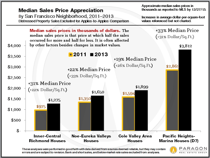
And this chart below looks at median sales price appreciation in a few higher priced home segments. Here, we also added the change in dollar per square foot values (though not reflected in the chart columns). Note that appreciation rates between median prices and dollar per square foot can vary in the same neighborhood, which emphasizes that these are general statistics best used for indicating trends and delineating the range of value changes.
————————————————–
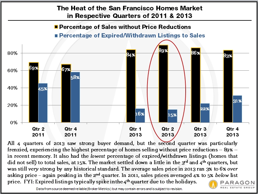
2013: Peak & Plateau
This chart is a bit complicated, but illustrates the differences in the heat of the market between 2011 and 2013, and, specifically, the peak of the market frenzy in the second quarter of 2013. In the second quarter, almost every statistical measure reflected the hottest market in recent memory: fewest price reductions and expired listings, lowest days on market, highest percentage of sales over list price, lowest interest rates in history, and so on. In the two quarters after, the market slowed and plateaued, but remained quite strong – as one can see by comparing them with 2011.
————————————————–
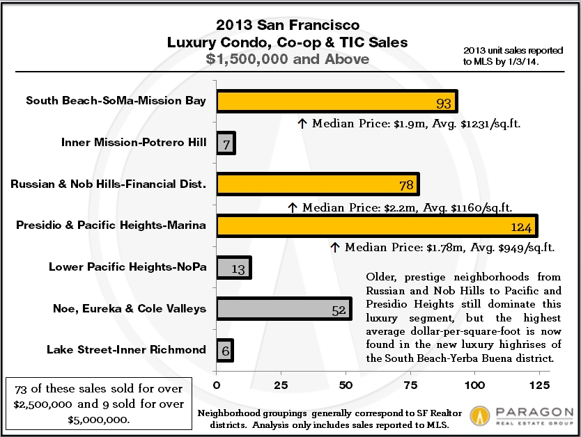
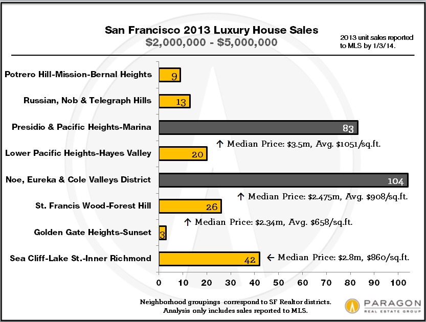
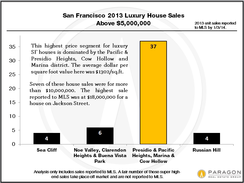
Selected 2013 Neighborhood & District Snapshots
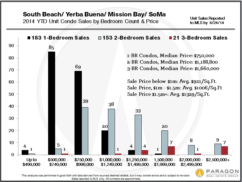
South Beach-SoMa-Yerba Buena-Mission Bay: Above is a look at the biggest condo market segment in the city, where the vast majority of new condo construction has occurred and is continuing to occur. Condos of every price range are found here, including a very substantial ultra-luxury component with extremely high dollar per square foot values (and typically with utterly spectacular views).
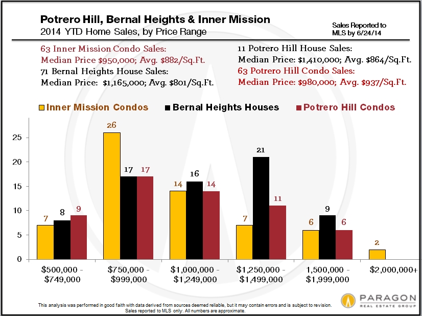
Snapshot of the Potrero Hill, Bernal Heights and Inner Mission markets
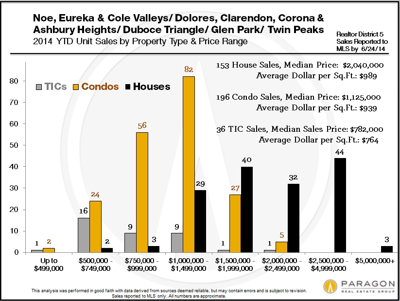
Noe-Eureka-Cole Valleys District Snapshot: An overview of house, condo and TIC sales in this very hot central district of the city.
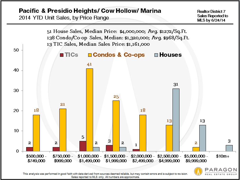
The Pacific & Presidio Heights, Cow Hollow and Marina market, where one finds the highest house prices in the Bay Area.
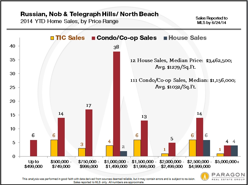
Russian, Nob & Telegraph Hills include some of the most expensive condos in San Francisco.
————————————————–
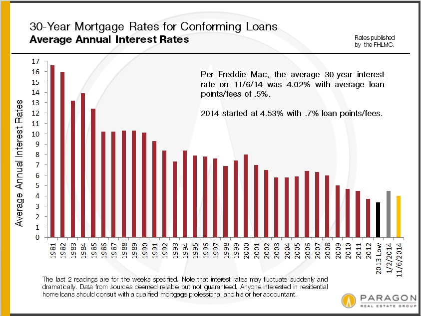
Mortgage Interest Rates
2014 started with a 30-year conforming interest rate of 4.5%, which is about a full percentage point above the historic lows one year ago. This affects the cost of homeownership significantly (if one is getting a loan), but the rate is still quite low in the context of the past 30 years.
All data from sources deemed reliable, but may contain errors and is subject to revision. Statistics are generalities
and how they apply to any particular property is unknown without a specific comparative market analysis.
All numbers should be considered approximate.
© 2014 Paragon Real Estate Group
Tags: buying san francisco real estate Christopher Stafford and Terry Wright real estate prices San Francisco luxury real estate
Categories: Uncategorized
Leave a comment