Interesting San Francisco Price Trends
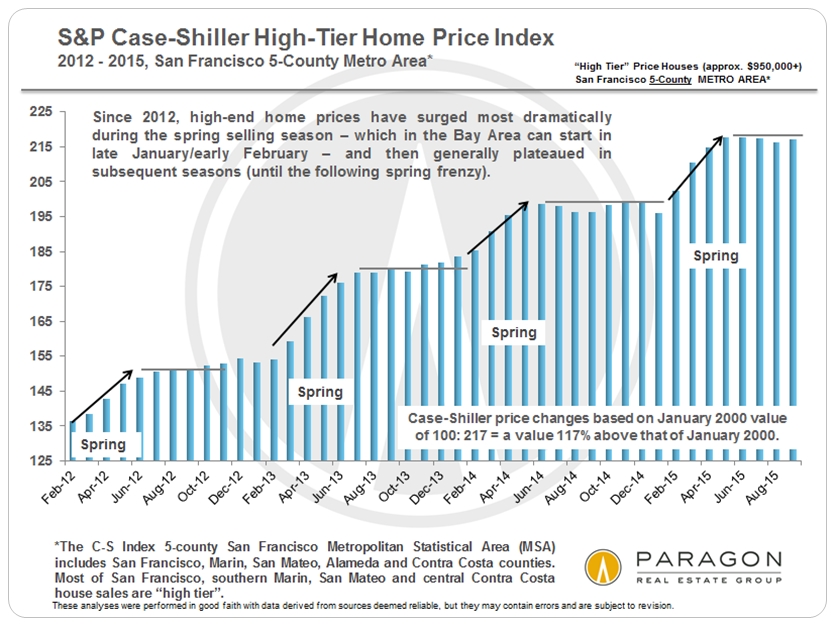
This chart gives an exceedingly clear illustration of the seasonality of home price appreciation over the past 4 years. Summer/autumn plateau in 2015? It’s happened to a large degree every year since 2012. We won’t really know where the market is headed next until we see what happens in early spring 2016. (Barring some large, negative economic event before then.)
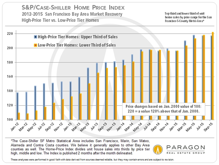
The higher priced home segment led the way in 2012 recovery in Bay Area, while the lower priced segment lagged because of having to deal with the huge hangover of the distressed property crisis. That started to equalize in late 2013 and 2014, and in 2015, more affordable homes began to overtake higher priced homes in the rate of home-price appreciation (as measured against values in January 2000). Case-Shiller is just starting to reflect a Bay Area dynamic that we’ve clearly been seeing playing out on the ground over the past year in San Francisco.
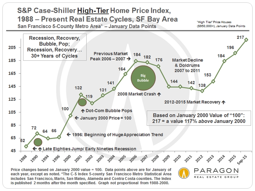
And one of our longer-term charts. Charts for the mid-priced and low-priced tiers can be found on our website. The high-price tier applies best to most of San Francisco and San Mateo, central/southern Marin, and central Contra Costa.
Tags: buying san francisco real estate Case-Shiller Index Christopher Stafford and Terry Wright luxury real estate Prices of San Francisco real estate San Francisco luxury real estate San Francisco price trends
Categories: Uncategorized
Leave a comment